THE NALTREXONE CLINIC
Full branding
Logo
Stationery
Web design
Marketing
Respectful patient centred communication
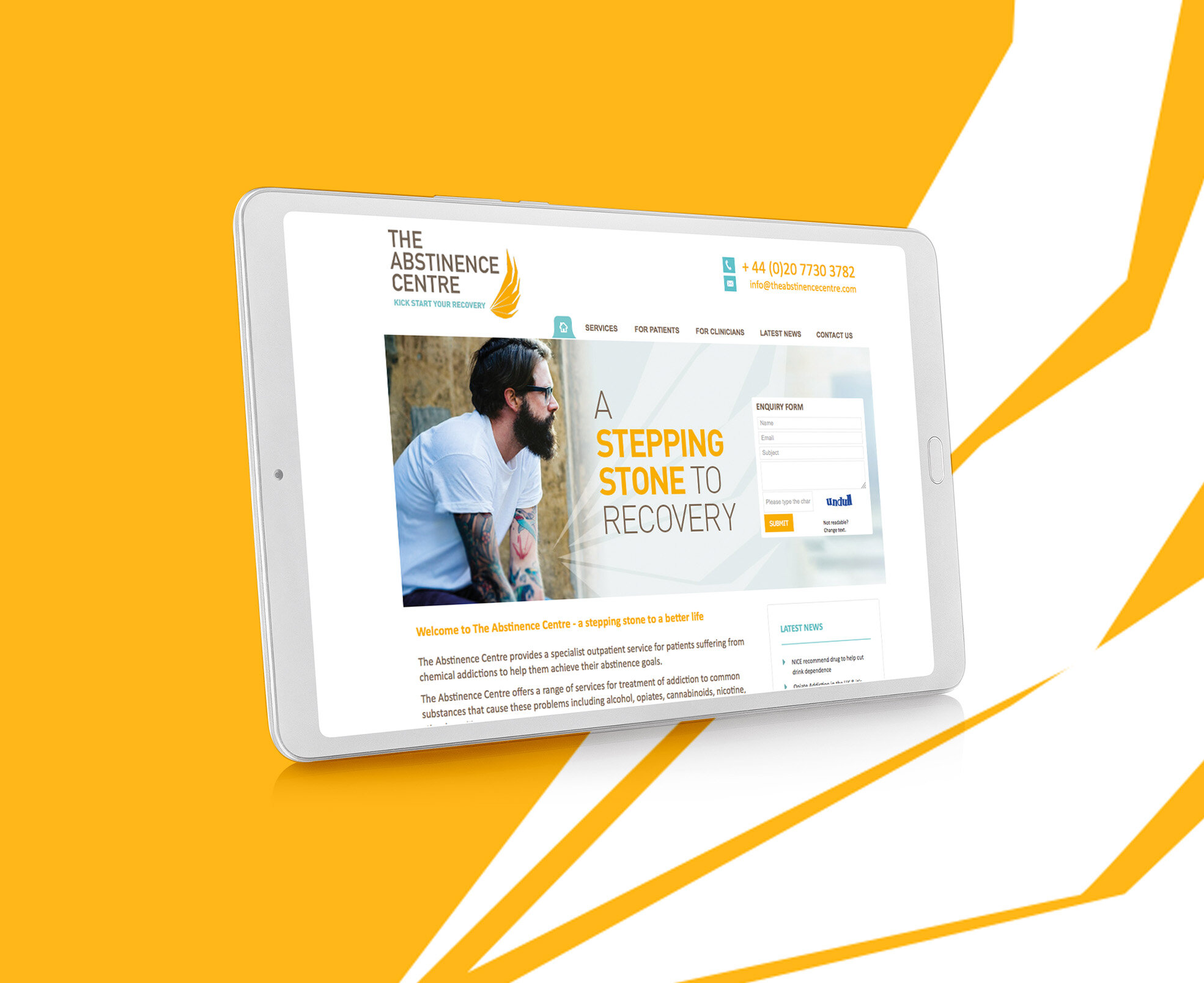
The Naltrexone Centre provides a specialist outpatient service for patients suffering from chemical addictions to help them achieve their abstinence goals.
It was very important that we got the tone right when we started looking at branding The Naltrexone Clinic. The visual language needed to match the copywriting, and speak to patients in a real and compassionate manner.
The wing of the phoenix symbolised rebirth and rising from the ashes, and the cheerful colour palette further set a hopeful tone.
It was also important to get the imagery right. We chose real people with a genuine integrity.


